Emily Paterson
Learning Experience Designer
Educational Materials: Making Learning Accessible
Duration: May-August 2023
Overview: Educational materials designed to help students create accessible websites on a popular e-portfolio platform.
Background:
As an intern for the non-profit Teach Access, I was asked to create an introductory video and tip sheet to support the awareness of digital accessibility for one of their partner organizations, Digication, which is an e-portfolio platform utilized by over 7,000 schools.
At this point, Digication’s platform had a few built-in accessibility features, such as a space to add image alt text or video captions, but it did not provide any additional instructions on how to properly use these features nor did it emphasize the importance of doing so.
Audience & Challenge:
As an e-portfolio tool, Digication is primarily used by university students who wish to showcase their work and achievements to a professor, prospective employer, and/or admissions officer. Coming from a variety of fields, these students likely have a limited understanding of what digital accessibility is and why it’s important. By catching students at this critical point in their lives, these educational materials have the potential to make a big impact in ensuring future products and services are created with accessibility in mind.
Goal:
I aimed to write an engaging video script, using plain language, to explain why accessibility matters to a student audience. To accompany that video, I also wanted to create a detailed tip sheet that outlined accepted best practices for digital accessibility with a specific focus on how to implement these on Digication.
Creation of the Video:
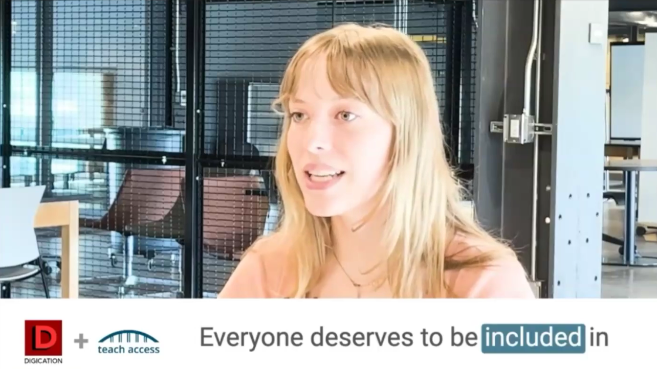
Aiming to create a video script to last around two minutes, I first began by taking a deep dive into Digication’s existing communications. Their catchphrase is “Make Learning Visible,” which I thought would make a great starting point for discussing that not everybody can perceive information in a visible way.
“For example, someone with a visual disability may have trouble seeing a photo that showcases your science project. Or someone with hearing loss might not be able to engage with your video that depends solely on your voice to explain something.“
By explaining these common barriers for users with disabilities, I aimed to contextualize the need for accessibility practices to avoid excluding these users from student websites.
“With over one billion people with some form of disability, it is crucial that your website will match the needs of this significant proportion of the population.“
As I continued, I also wanted students to note that these accessible practices will ensure that their target audience (employers, admissions offices, etc.), regardless of their abilities, will be able to engage with the work that they are showcasing online.
“And keep in mind that everyone benefits from accessible practices! By making text large enough to read or adding captions, we all get to understand and enjoy things more clearly and easily.“
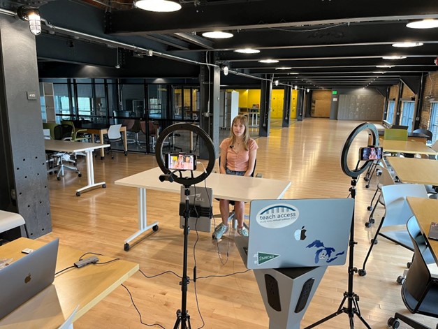
Once the script was written and edited, I then had the opportunity to act as the video spokesperson when we filmed in August. As someone more used to being behind the scenes, I appreciated the challenge to exercise my presence in front of the camera. After filming, the video was then edited by the team at Digication.
Creation of the Tip Sheet:
As I embarked on creating an accessibility tip sheet, I knew that I wanted to blend existing best practices with instructions on how to implement these practices on Digication. Drawing largely upon the Web Content Accessibility Guidelines (WCAG), I aimed to synthesize these guidelines into a few broad tip categories that would be most relevant to users creating an e-portfolio:
- Color Contrast
- Text Styles
- Added Context
- Heading Styles
- List Styles
- Tables
- Capitalization
- Alternative Text
- Multiple Avenues for Multimedia
- Unusual Words, Idioms, Abbreviations, and Acronyms
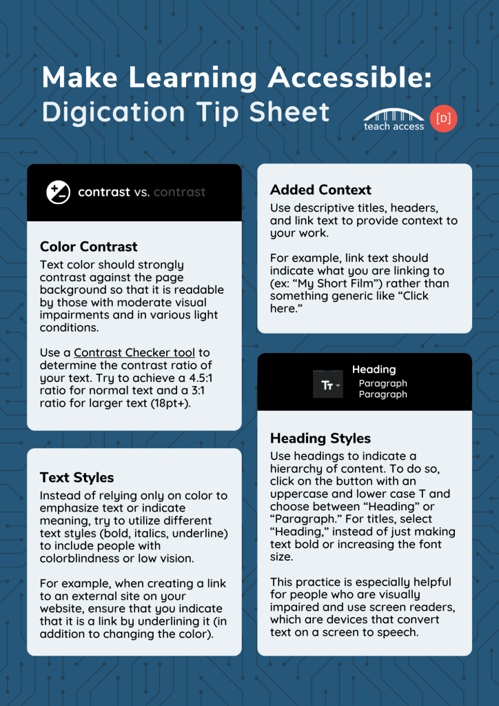
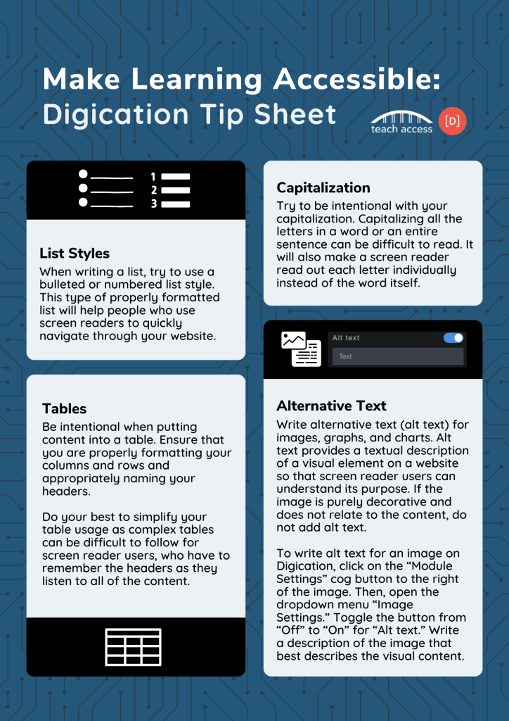
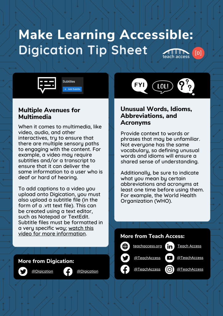
For all of these tip categories, I gave an overview of what they entailed and how a user could generally adjust their content to become more accessible. For three of the categories (heading styles, alternative text, and multiple avenues for multimedia), I also wrote step-by-step instructions for locating and practicing these accessibility features on Digication. These instructions were previously non-existent for users.
Impact
As the foundational creator of both the video and tip sheet, I had been eagerly waiting to see how my work would be integrated within Digication’s platform!
In April 2024, Digication announced a new feature that flags accessibility issues, including images without alt text or videos without captions. Before they can publish their website, users will have to address any of these issues. At that point, my video is introduced alongside a drop-down menu of the tips that I wrote. These educational materials have the chance to reach and educate the millions of students that use the platform. It’s an exciting moment for me to play a role in building a future where accessibility is at the forefront of people’s minds.

Emily Paterson
Learning Experience Designer
Send me an email at
emilyypatersonn[@]gmail.com
